A Knight Checkmate:
How we created a new design of bank cards for Absolut Bank (Russia)
Project: A Knight Checkmate
Client: Absolut Bank (Russian TOP 10% commercial bank)
Agency: Great Crew
A plastic card is one of the points of contact of a bank's everyday communication with its customers. We wanted to create a new concept of bank cards, in oppose to those which are often have featureless, uninteresting and dull design.
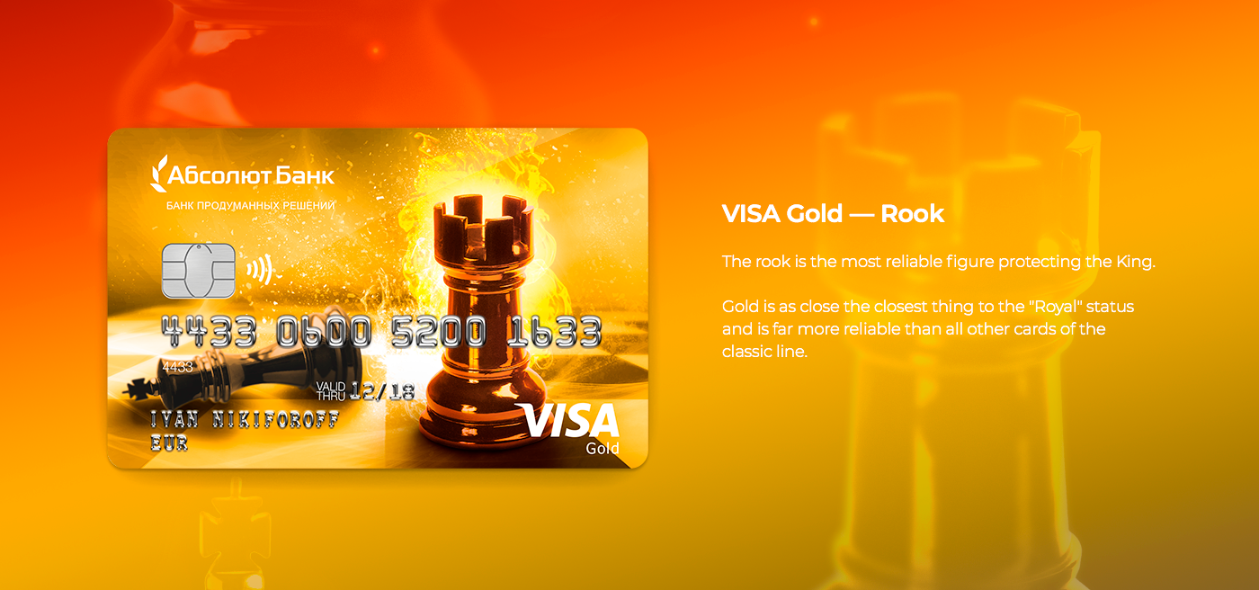
The concept of "chess" cards invokes the idea of a strategic vision and the right chess play could equal checkmate. Thorough solutions concept is visualized in the importance of choosing the right chess piece each play and this goes hand-in-hand with choosing the right credit card.
Each card in the series represents one of the chess pieces. The amount of privileges each bank card provides is reflected by the rank
of the chess piece.
The fire symbolizes the intensity of strength, power, and speed. One of which could only belong to someone with supernatural abilities.
This is a common visual image, which is commonly portrayed in art: paintings of gods, heroes and mythical creatures.
In this concept, fire solves several strategic tasks which strengthens the image of Absolut Bank. The defeated figure of the opponent's King shows the finale this depicts the Godlike strength and strategy of the bank. The fire encapsulates the speed and effectiveness of this victory - killing the stereotype of it being a time-consuming game, but instead it can be supersonic victory. The branded figure of Absolut Bank shines with an orange fiery halo of victory.